


The Worst Fonts
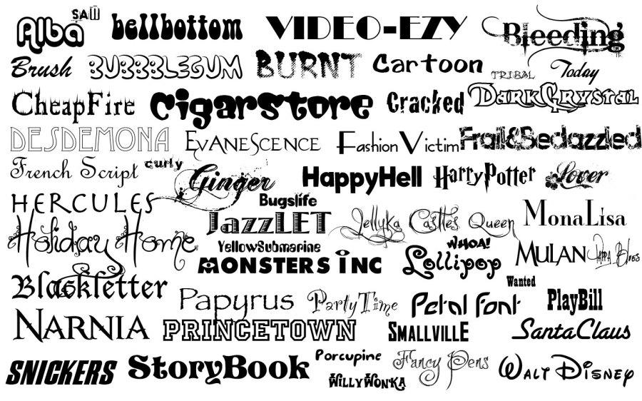
Although I have my own personal list of hated fonts, MS outlook being at the top of the list, I probably don’t have the qualifications in the aesthetic field to rant publically about them. So instead of my opinion, here are some of the worst font types according to famous Graphic designers in the article “7 Graphic Designers Share What they think Is the Worst Font Ever” on the website complex.com:
4. Myriad: “It’s not that the structure is ugly, it’s just that in its blandness and absence of style, it is so boring that it turns the viewer off immediately. Myriad is the stale saltine cracker of the typeface world” – Liz Meyer
3. Birth of a Hero: “I just can’t handle it. Obviously based on Avant Garde then mixed up with a little distress, it screams, “I’m clean cut, yet edgy!” It’s the ‘tone it down for Grandma at Thanksgiving’” – Chuck Anderson
2. Curlz: “It’s not functional: Someone forgot the part about being able to read the words.It’s overused: One of the great mysteries in life.” – Josh Smith
1.Times New Roman: “Just hearing the name “Times New Roman” itself can conjure up memories that one wishes they could quickly forget. Numerous nights of formatting papers by shrinking the margin 1/8 of an inch, expanding the double space to 2.5, and slightly enlarging the font to 12.2pt; any which way to meet an arbitrary page quota on a paper… it’s the worst typeface based on stigma alone” – Allan Yu